最近做的一个项目需要用到侧滑菜单,在GitHub上找了下,有个很热门的drawer Library,https://github.com/mikepenz/MaterialDrawer,用起来挺方便的,使用方法也详细。但还是想自己动手写一个,因为Google在SDK中增加了DrawerLayout,NavigationView,实现侧滑菜单还是挺方便的。
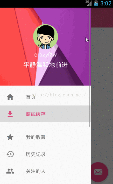
先看下gif效果图:
实现步骤:
1.写主布局 activity_main.xml
1
2
3
4
5
6
7
8
9
10
11
12
13
14
15
16
17
18
19
20
21
22
|
<android.support.v4.widget.DrawerLayout
xmlns:android="http://schemas.android.com/apk/res/android"
xmlns:app="http://schemas.android.com/apk/res-auto"
android:id="@+id/id_drawerlayout"
android:layout_width="match_parent"
android:layout_height="match_parent">
<include layout="@layout/content_main" />
<android.support.design.widget.NavigationView
android:id="@+id/id_navigationview"
android:layout_width="match_parent"
android:layout_height="match_parent"
app:itemTextColor="@color/selector_nav_menu_textcolor"
android:layout_gravity="left" />
</android.support.v4.widget.DrawerLayout>
|
这里注意一下,主界面的内容一定要放在DrawerLayout的第一个位置,第二个位置应该放置的是Drawer的菜单内容,可以有多种方式自定义,我这里使用的是NavigationView。
NavigationView有几个属性需要注意的:
app:headerLayout: 可以指定自己定义的布局作为NavigationView的头部
app:menu: 指定Nav中的Menu菜单项布局
app:itemTextColor: 用来设置Nav中,menu item的颜色选择器。在选择器中可以定义文字被选中状态的颜色以及正常状态下的颜色
如本例的 selector_nav_menu_textcolor.xml:
1
2
3
4
5
6
7
8
9
|
<?xml version="1.0" encoding="utf-8"?>
<selector xmlns:android="http://schemas.android.com/apk/res/android">
<item android:color="@color/main_pink_light" android:state_checked="true" />
<item android:color="@color/main_black_grey" />
</selector>
|
1
2
3
4
5
6
7
8
9
10
11
12
13
14
15
16
17
18
19
20
21
22
23
24
25
26
27
28
29
30
31
32
33
34
35
36
| <?xml version="1.0" encoding="utf-8"?>
<LinearLayout xmlns:android="http://schemas.android.com/apk/res/android"
android:layout_width="match_parent"
android:layout_height="220dp"
android:background="@drawable/nav_header"
android:gravity="center"
android:orientation="vertical">
<com.crazyfzw.materialdrawer.CircleImageView
xmlns:app="http://schemas.android.com/apk/res-auto"
android:id="@+id/current_userAvater"
android:layout_width="70dp"
android:layout_height="70dp"
app:civ_border_width="0dp"
app:civ_border_color="#FFFFFF"/>
<TextView
android:id="@+id/current_userName"
android:layout_width="wrap_content"
android:layout_height="wrap_content"
android:layout_marginTop="4dp"
android:textColor="@color/text__white"
android:textSize="16sp"
android:text="crazyfzw"/>
<TextView
android:id="@+id/current_userSignature"
android:layout_width="wrap_content"
android:layout_height="wrap_content"
android:layout_marginTop="5dp"
android:textColor="@color/text__white"
android:textSize="18sp"
android:text="野蛮体魄"/>
</LinearLayout>
|
上面用到的CircleImageView是GitHub上一个热门的开源控件,这里给出地址:https://github.com/hdodenhof/CircleImageView,当然你也可以extend ImageView去自定义
1
2
3
4
5
6
7
8
9
10
11
12
13
14
15
16
17
18
19
20
21
22
23
24
25
26
27
28
29
30
31
32
33
34
35
36
37
38
39
40
41
42
43
44
45
46
47
48
49
50
51
52
53
54
55
56
57
58
59
60
61
62
| <?xml version="1.0" encoding="utf-8"?>
<menu android:checkableBehavior="single"
xmlns:android="http://schemas.android.com/apk/res/android">
<group android:id="@+id/nav_group1" android:checkableBehavior="single">
<item
android:icon="@drawable/ic_home_black_24dp"
android:id="@+id/nav_home"
android:title="@string/nav_home"
android:checkable="true" />
<item
android:icon="@drawable/ic_file_download_black_24dp"
android:id="@+id/nav_offline_manager"
android:title="@string/nav_offline_manager"
android:checkable="true" />
</group>
<group android:id="@+id/nav_group2" android:checkableBehavior="single">
<item
android:icon="@drawable/ic_star_black_24dp"
android:id="@+id/nav_favorites"
android:title="@string/nav_favorites"
android:checkable="true" />
<item
android:icon="@drawable/ic_history_black_24dp"
android:id="@+id/nav_histories"
android:title="@string/nav_histories"
android:checkable="true" />
<item
android:icon="@drawable/ic_people_black_24dp"
android:id="@+id/nav_following"
android:title="@string/nav_following"
android:checkable="true" />
<item
android:icon="@drawable/ic_account_balance_wallet_black_24dp"
android:id="@+id/nav_pay"
android:title="@string/nav_growth_process"
android:checkable="true" />
</group>
<group android:id="@+id/nav_group3" android:checkableBehavior="single">
<item
android:icon="@drawable/ic_color_lens_black_24dp"
android:id="@+id/nav_theme"
android:orderInCategory="1"
android:title="@string/title_theme_store"
android:checkable="true" />
<item
android:icon="@drawable/ic_settings_black_24dp"
android:id="@+id/nav_settings"
android:orderInCategory="3"
android:title="@string/nav_settings"
android:checkable="true" />
</group>
</menu>
|
这里的group用来分组,android:checkableBehavior=”single”用来指明选项菜单只能单选。android:checkable=”true”指定item项是否可选,图标的话,这里推荐使用google官方的 Material icons
4.最后一步就是用java在activity中把自定义的布局添加进来并初始化DrawerLayout了,这里给出MainAtivity的主要代码
1
2
3
4
5
6
7
8
9
10
11
12
13
14
15
16
17
18
19
20
21
22
23
24
25
26
27
28
29
30
31
32
33
34
35
36
37
38
39
40
41
42
43
44
45
46
47
48
49
50
51
52
53
54
55
56
| public void initViews() {
toolbar = (Toolbar) findViewById(R.id.toolbar);
setSupportActionBar(toolbar);
mDrawerLayout = (DrawerLayout) findViewById(R.id.id_drawerlayout);
mNavigationView = (NavigationView) findViewById(R.id.id_navigationview);
ActionBarDrawerToggle mActionBarDrawerToggle = new ActionBarDrawerToggle(this, mDrawerLayout, toolbar, R.string.open, R.string.close);
mActionBarDrawerToggle.syncState();
mDrawerLayout.setDrawerListener(mActionBarDrawerToggle);
mNavigationView.inflateHeaderView(R.layout.navigation_header);
mNavigationView.inflateMenu(R.menu.menu_navigation);
onNavgationViewMenuItemSelected(mNavigationView);
View navheaderView = mNavigationView.getHeaderView(0);
currentUserAvater = (CircleImageView) navheaderView.findViewById(R.id.current_userAvater);
currentUserName = (TextView) navheaderView.findViewById(R.id.current_userName);
currentUserSignature = (TextView) navheaderView.findViewById(R.id.current_userSignature);
currentUserAvater.setImageResource(R.drawable.default_avater);
currentUserName.setText("crazyfzw");
currentUserSignature.setText("平静温和地前进");
}
private void onNavgationViewMenuItemSelected(NavigationView mNav) {
mNav.setNavigationItemSelectedListener(new NavigationView.OnNavigationItemSelectedListener() {
@Override
public boolean onNavigationItemSelected(MenuItem menuItem) {
String msgString = "";
switch (menuItem.getItemId()) {
}
menuItem.setChecked(true);
mDrawerLayout.closeDrawers();
return true;
}
});
}
|
这里我用的是
1
2
| NavigationView.inflateHeaderView(R.layout.navigation_header);
NavigationView.inflateMenu(R.menu.menu_navigation);
|
来添加自定义的NavigationView头部,及菜单布局,当然,你也可以用上面题到的静态属性app:headerLayout:及app:menu:指定,上面代码中有个地方需要特别注意了,就是
1
2
| View navheaderView = mNavigationView.getHeaderView(0);
currentUserName = (TextView) navheaderView.findViewById(R.id.current_userName);
|
这里如果直接用findViewById()获取NavigationView的中的控件会出现空指针异常,如图:

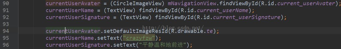
因为在activity刚创建的时候,Dawer其实是没有打开的,所以布局没有初始化加载进来,这时去findViewById()自然会找不到了。解决的办法是通过NavigationView.getHeaderView(0);获取到navheaderView,然互在通过navheaderView.findViewById()就可以找到相应的空间了。
当然你也可以在在inflateHeaderView的同时取到这个navheaderView,代码如下
1
2
| View navheaderView = mNavigationView.inflateHeaderView(R.layout.navigation_header);
currentUserName = (TextView) navheaderView.findViewById(R.id.current_userName);
|
本案例的源码可以到我的GitHub上下载或者Star: https://github.com/crazyfzw/MaterialDrawer